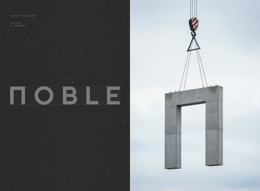
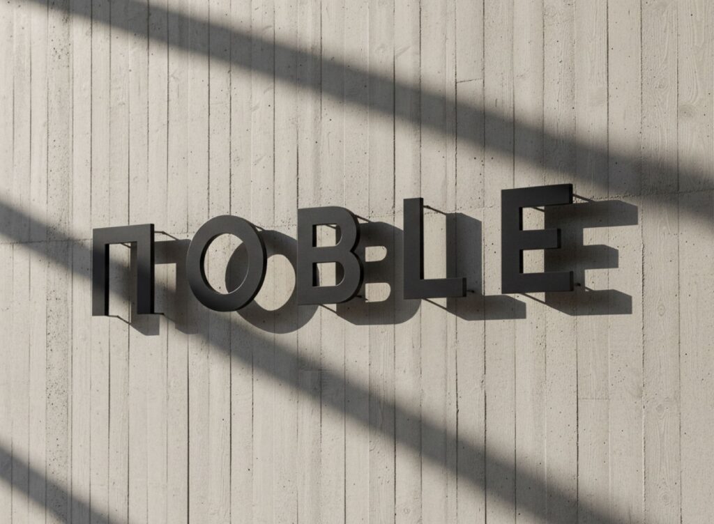
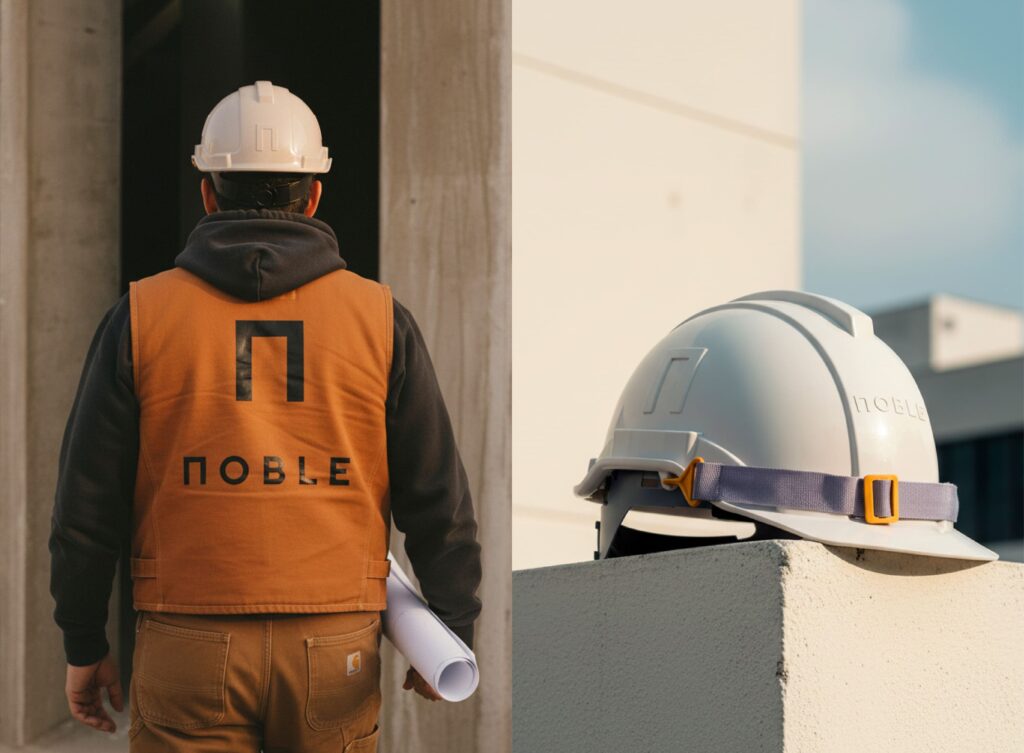
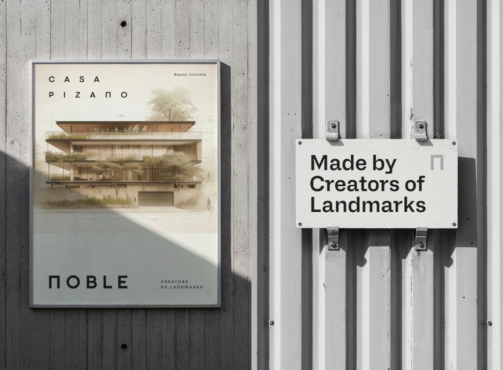
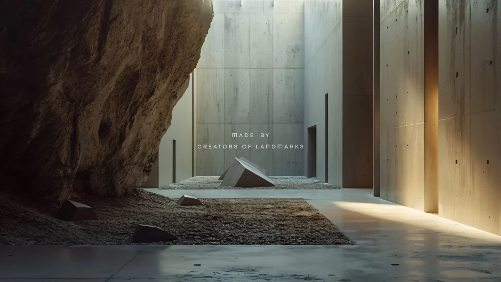
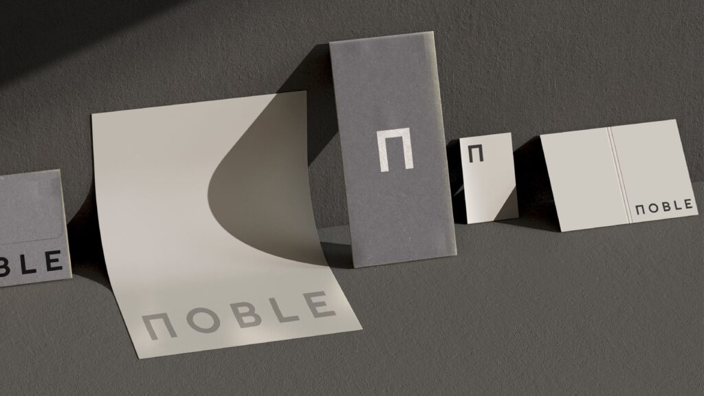
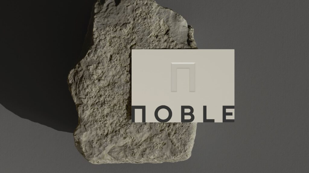
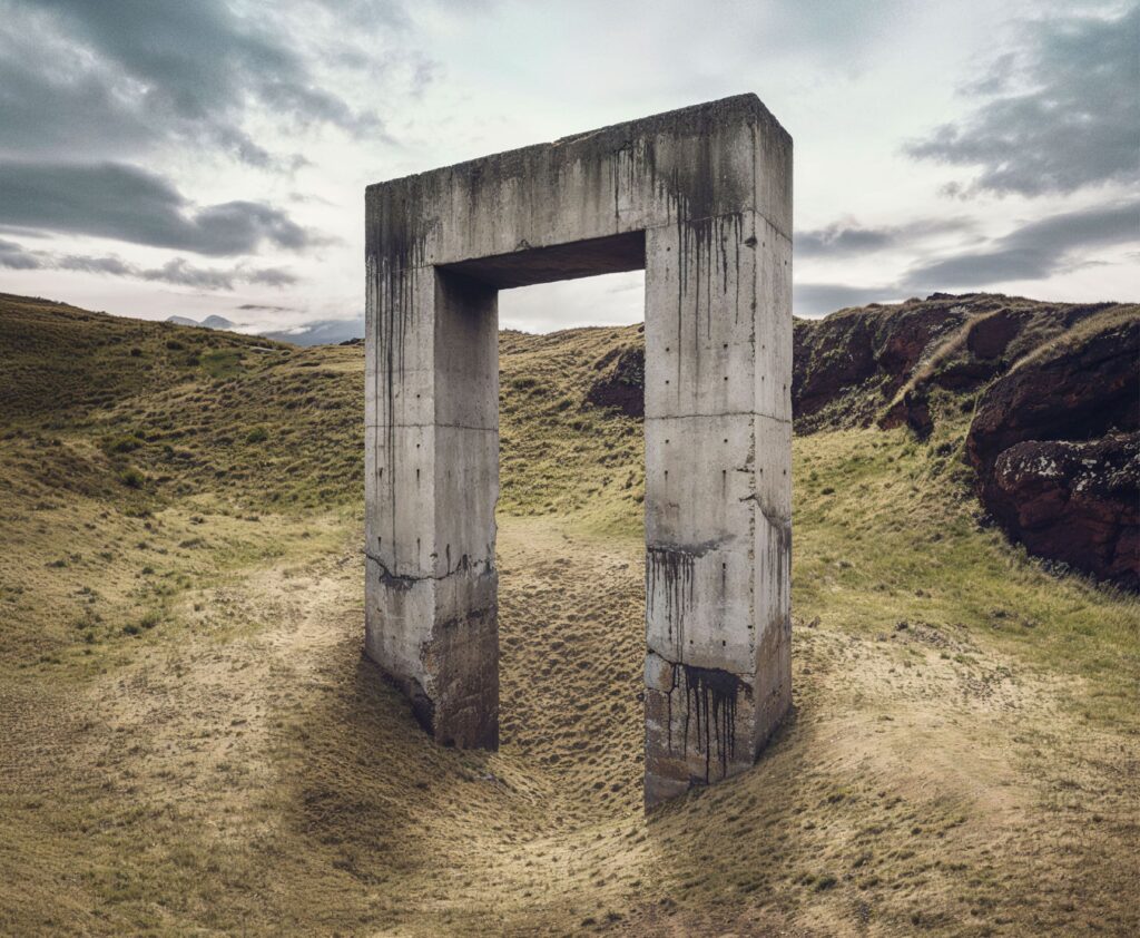
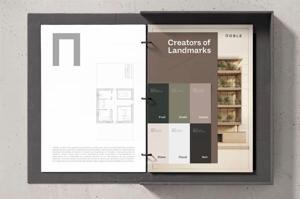
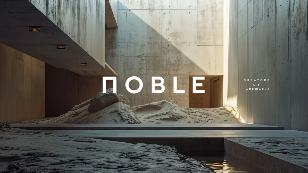
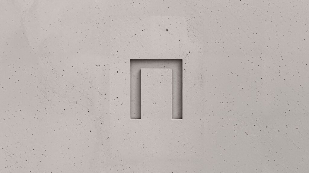
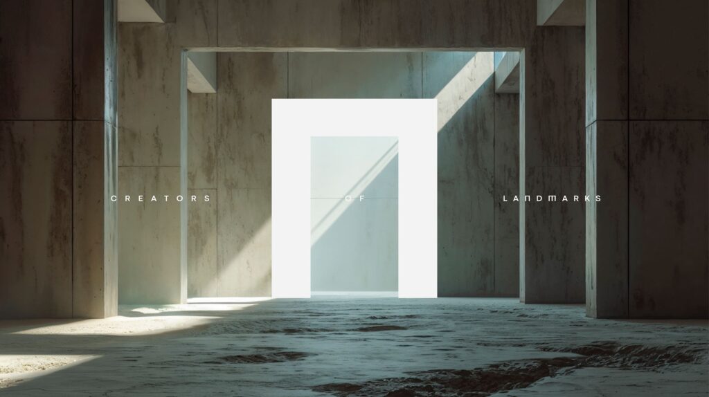
NOBLE’s new identity is based on an essential premise: doors and portals as metaphors for origin, openness, and transcendence in architecture. Inspired by geometric purity and the nobility of materials, the brand redefines its visual presence with a symbol that acts as an architectural signature, an authorial seal that enshrines each project as a unique work. The Π symbol—reinterpreted as a contemporary portal—evokes the balance between structure and meaning, between technique and emotion. The visual system, with its mineral tones and tactile texture, projects serenity, precision, and permanence. Each piece, from paper to concrete, embodies the studio’s constructive rigor and restrained elegance. More than a logo, NOBLE is a statement of purpose: to create spaces that dignify human life and celebrate the beauty of the architectural process. With a “Marketing-first-architecture” approach, the identity embraces innovation without sacrificing integrity, connecting art, design, and purpose. Thus, NOBLE stands as a creator of landmarks —“Creators of Landmarks”—, guided by the light of honesty, greatness and generosity.